Content › Custom field types
Introduction
Content
Using content
Plugins
Recipes
Custom field types
What you'll learn
Use field types from packages, such as color from @easy-cms/fields, and write your own: a
type with its own checks, its own input in the admin and its own look in lists.
Before this page: Fields. For the admin part: Admin components.
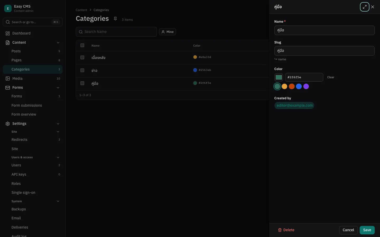
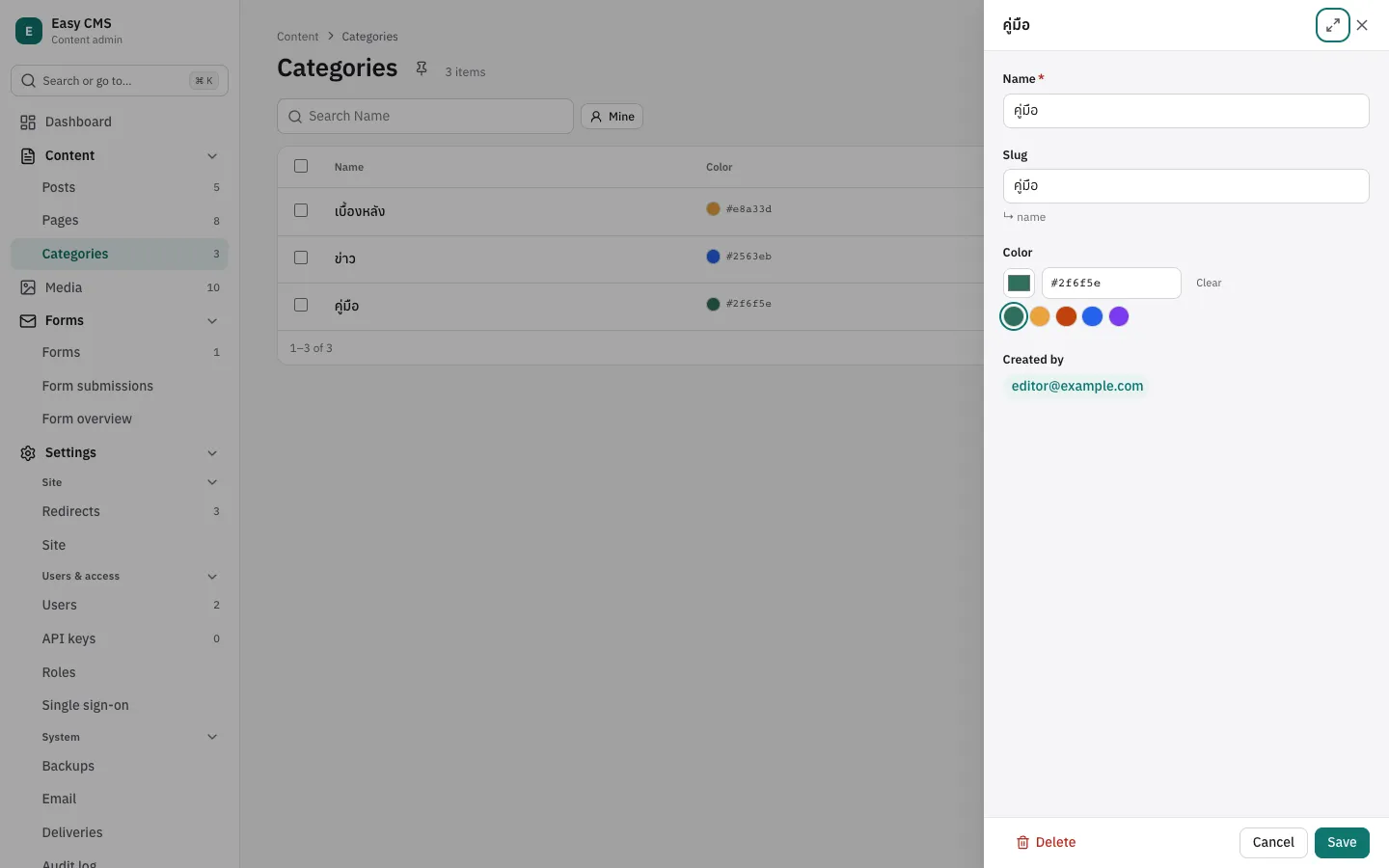
Easy CMS has built-in field types for most content. A package can add more: a color, a rating, a phone number. Each one is stored like a built-in type (its base), so queries, the REST API, localization and migrations work as they do for that type. What it adds is its own validation, its own input in the admin and its own cell in lists.
Colors: @easy-cms/fields
npm install @easy-cms/fieldspnpm add @easy-cms/fieldsyarn add @easy-cms/fieldsbun add @easy-cms/fieldsList the type in fieldTypes, then use it like any other:
import { color } from '@easy-cms/fields'

export default defineConfig({
  // …
  fieldTypes: [color],
  collections: [
    {
      slug: 'categories',
      fields: [
        { name: 'name', type: 'text', required: true },
        { name: 'color', type: 'color', presets: ['#2f6f5e', '#e8a33d', '#2563eb'] },
      ],
    },
  ],
})| Option | Type | |
|---|---|---|
presets | string[] | Colors offered as swatches, e.g. your brand's. |
alpha | boolean | Allow transparency: #rrggbbaa as well as #rrggbb. Default false. |
The value is a string like #2f6f5e (stored as text). Other values are rejected with
"must be a color like #2f6f5e". In the admin, editors pick a color, type its code or click a
suggested one; lists show a swatch next to the code, as a column that is on by default.
Add the column to an existing database like any new field:
npx easy-cms migrate:create category_colorpnpm exec easy-cms migrate:create category_coloryarn easy-cms migrate:create category_colorbunx easy-cms migrate:create category_colorTypeScript
Importing the package teaches TypeScript the new type: type: 'color' is accepted in fields,
its options are checked, and documents have color?: string | null. easy-cms generate:types
writes string too.
Writing a field type
A field type is a plain object. defineFieldType checks it against FieldTypeDefinition:
// rating.ts
import { defineFieldType } from '@easy-cms/core'

export const rating = defineFieldType({
  name: 'rating',
  // Stored, queried and sorted as a number.
  base: 'number',
  // Not called for empty values: `required` covers those.
  validate: (value, { field }) =>
    (Number.isInteger(value) && Number(value) >= 1 && Number(value) <= Number(field.max ?? 5)) ||
    'must be 1 to 5 stars',
  // Mistakes in a field's options, found when the config loads.
  checkOptions: (field) =>
    field.max === undefined || Number.isInteger(field.max) ? undefined : 'max must be a whole number',
  admin: {
    component: 'ecms-stars',            // the input
    cell: 'ecms-stars-cell',            // in lists
    module: '@acme/easy-cms-rating/admin',
    props: ['max'],                     // field options the components get as `options`
  },
  typescript: '1 | 2 | 3 | 4 | 5',      // for generate:types
})| Option | ||
|---|---|---|
name | Required | The type fields use: lowercase letters and digits, starting with a letter (rating, phoneNumber). Not a built-in type's name. |
base | Required | How it is stored: text, textarea, email, number, boolean, date or json. |
validate | (value, { field, data, operation, … }) => true | string, may be async. field has the field's own options. A field's own validate runs after it. | |
checkOptions | (field) => string | undefined: a message makes the config invalid. | |
admin.component | The input: a Web Component (tag starting with ecms-). Without it, the base type's input. | |
admin.cell | Shows the value in lists. Without it, the value as text. | |
admin.module | The admin module that defines the components; added to admin.modules for you. | |
admin.props | Field options passed to the components as options. | |
typescript | The value's type for generate:types. Default: the base type's. |
The components follow the admin component contract: the
input gets value, options, readOnly, label and uiLocale, and sends
new CustomEvent('change', { detail: value }). A cell gets the same properties, read-only.
A field that sets admin.component itself keeps it, so a project can swap the input of one field.
Types for your package
Tell TypeScript about the type by adding it to CustomFieldTypes, with its value and options:
declare module '@easy-cms/core' {
  interface CustomFieldTypes {
    rating: { value: 1 | 2 | 3 | 4 | 5; options: { readonly max?: number } }
  }
}
Put this next to defineFieldType in your package's entry, so it applies wherever the package is
imported.
Rules
- Names are checked when the config loads: a built-in name (
text,select…) or a type listed twice is an error, and so is a field whosetypeno listed type provides. - The type adds behavior, not storage: changing a field from
texttocolorneeds no migration, and removing the package leaves the values as text. - Keep the admin module free of imports, as for any admin module.
Next steps
- Admin components: the elements in more detail.
- Fields: the built-in types.